
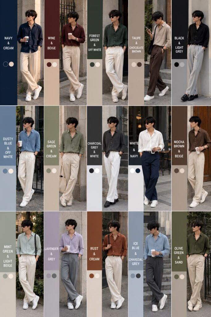
Most men think looking expensive means spending more. It usually means spending smarter — on colour.
Two guys can wear the same $40 t-shirt. One looks like he grabbed it off a clearance rack; the other looks like he dresses on purpose. The difference is rarely the shirt itself. It’s what surrounds it — the trousers, the shoes, the jacket — and whether those pieces were chosen to work together, or just happened to land in the same closet.
That’s the whole logic behind the “old money” colour palette: a small rotation of neutral, muted shades that has outfitted well-dressed men for close to a century, mostly because none of them ask to be the main character. No logos, no seasonal “it” colour, no outfit that needs explaining.
What Actually Makes a Colour Palette Read as “Old Money”:-
Forget the fancy names — it really just means not going overboard. The colors are soft and calm, not bright and loud. They share warm or cool undertones so nothing fights. And — this part gets skipped — there are only about ten of them total. Fewer colors means fewer chances to pick wrong.
Now think about fashion trends — the “cool” color keeps changing almost every year.
Sage green was everywhere not long ago — it already looks a bit old now. But the navy never had that problem, and it never will, because navy was never trying to be trendy in the first place.
Ten Colours, and What Each One Is For:-
- White. This one does the most work of all the colors. You’ll see it in dress shirts, formal shoes, polo shirts, and plain t-shirts. And it does something special: it makes whatever’s next to it look neater. A few good white shirts might actually help you more than one costly jacket.
- Navy. If you own exactly one blazer, it should be navy — dark enough to pass for formal, light enough (relatively) to wear on a Tuesday. It’s the anchor color, the one everything else in your closet gets measured against.
- Beige. People underrate this one badly. Beige chinos do more work in a wardrobe than almost anything else you could buy, mostly because beige photographs as “put together” without trying to look like anything in particular. Think of it as the color equivalent of a good handshake.
- Cream. Softer and warmer than white, and it shines in tonal outfits — cream over beige over camel, no strong contrast anywhere, just layers of the same warm register. Sweaters and linen shirts are where cream earns its keep.
- Light grey. The middle ground between white’s crispness and charcoal’s weight. Works in lightweight suits, in knitwear, in basically anything that calls for “clean” without “cold.”
- Charcoal. The most formal neutral on this list, and the one that does black’s job without black’s severity. Winter coats, heavier suits, cold-weather knitwear — charcoal carries authority without looking like you’re headed to a funeral.
- Brown. For leather, full stop. Warmer and more forgiving than black for anything short of black-tie. The one rule that actually matters here: match your belt to your shoes, same brown family, no exceptions. Mismatched leather undercuts an otherwise good outfit faster than almost anything else.
- Olive. The lone earthy tone in a palette built on neutrals, and it earns its place because it’s muted enough to blend in rather than announce itself. Olive chinos, white shirt, tan loafers — that combination has worked for decades, and there’s no reason to fix it.
- Camel. This is the one people picture when they hear “old money” — a camel overcoat over a navy suit is about as close to a uniform as this whole aesthetic has.It looks great in photos, it holds up well over time, and it almost never looks like you’re trying too hard.
- Black. Use black very little — that’s not just a tip, that’s the whole rule. Black is best for very fancy events, dress shoes, and small things like wallets and belts. Other than that, navy, charcoal, and brown will usually look better on you. One everyday exception to remember: a black turtleneck with grey pants — that combo just works.
Combinations That Actually Work:-
| Pairing | Where it fits | Why it works |
| White + navy | Everyday, office | The classic; hard to overthink |
| Beige + white | Summer, travel | Warm without trying |
| Grey + white | Office, smart casual | Reads modern and sharp |
| Camel + cream | Fall, evenings | Tonal, rich, no hard edges |
| Olive + beige | Weekend, outdoors | Earthy, grounded |
| Brown + navy | Smart casual, work | Warm meets sharp |
| Black + grey | Formal, evening | Sleek, a little severe |
Notice the pattern: every pairing matches warm with warm or cool with cool. That’s the actual mechanism behind why these combinations look intentional rather than accidental. Cross a warm tone with a cool one carelessly — camel next to charcoal, say — and you get visual tension instead of harmony, even though both colors are perfectly respectable on their own.
Just Build and Design your Own Wardrobe without Overthinking about it:–
Firstly just start with these top recommended three pieces: a white shirt, beige chinos, a navy blazer. That’s not a bare minimum — it’s genuinely most of what you need, and the combinations those three alone produce will outlast a much bigger, messier closet.
From there, follow one rule: every new piece should already work with at least three things you own. If it doesn’t, it’s not versatile — it’s a liability sitting in your closet waiting for an occasion. Add one accent colour at a time, olive or light blue, never both in the same purchase, and keep your leather matched. Skip anything neon; those colours date an outfit faster than almost anything else you could wear.
And don’t chase perfect coordination. An outfit where every shade matches exactly starts to look like a costume rather than clothing. The goal is balance, not precision — two or three colors in the same tonal family, not a color-matched uniform.
What to Leave Out:-
Neon green, fluorescent yellow, electric blue — these aren’t banned outright, but none of them belong to an outfit. Bright orange and hot pink work fine as a small accent, a pocket square say, and fall apart the moment they become the main colour. Graphic prints with several competing colours are the fastest way to undo everything else on this list.
Where People Actually Go Wrong:-
The most common mistake isn’t picking a bad colour — it’s picking too many good ones at once. Two colours is usually enough. Three is the ceiling, not the target. Past that, an outfit starts to look busy no matter how “correct” each individual shade is.
Your skin tone is the whole game changer which matters more than most guys notice. If you have a warm skin colour then, shades like camel, beige, and olive usually suit you well. If your skin has a cooler feel to it, navy, grey, and white usually look better instead. Also, don’t confuse faded clothes with “relaxed” clothes — worn-out beige or grey just looks old, not stylish. That is something you have to watch out for if you’re buying second-hand clothes.
The Short Version:-
Timeless colours keep working because they were never chasing a trend to begin with. Muted tones read as more expensive than bright ones. A small palette means fewer decisions to get wrong. And matching tones matters more than matching exactly.
If you’re starting from nothing: white, navy, beige, and grey. Those four alone will outperform most wardrobes built on twice as many colours. Add camel, cream, and olive one piece at a time, and don’t rush it — this is a wardrobe you build over a couple of years, not a weekend.
